Showing posts with label Typography. Show all posts
Showing posts with label Typography. Show all posts
5 July 2010
9 May 2010

8 May 2010
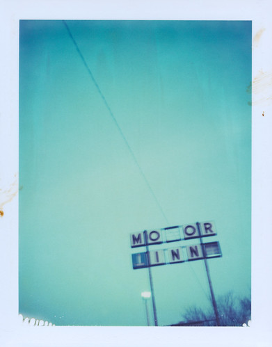
Public market
Sign in Seattle, 2009. Photo by Kevin Balluff.
Kevin spends his free time sitting in traffic: "It's sport to me. With nowhere to go, I'll prowl the concrete arteries of the city, counting women doing their makeup in the rearview, men eating an artery-buster burger, kids throwing a tantrum in the backseat like chimpanzees in a shitfight. Ahh, I love Los Angeles."

Kevin spends his free time sitting in traffic: "It's sport to me. With nowhere to go, I'll prowl the concrete arteries of the city, counting women doing their makeup in the rearview, men eating an artery-buster burger, kids throwing a tantrum in the backseat like chimpanzees in a shitfight. Ahh, I love Los Angeles."
11 April 2010
Brasil em cartaz
Rico Lins is one of the most important Brazilian graphic designers. As I read in wikipedia "Designer, art director, illustrator and educator, Rico Lins has accumulated an extensive curriculum of professional and didactic activities in expressive institutions and companies both in Brazil and abroad". His site is under construction but you can see his studio work on flickr.

23 March 2010
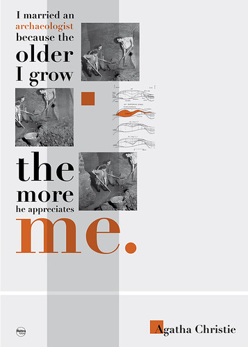
Penguin Classics

Coralie Bickford-Smith is a senior cover designer at Penguin Books,
where she has created several series designs. She studied typography
at Reading university and has recently been sharing her experience with
students at London College of Communication encouraging a sense
of play in the process of design. This is a spread of the Penguin Classics catalogue she designed.
20 March 2010

Ten Images for Ithaca 2010
Theme: Labels
1st prize 1000 €, 2nd prize 600 €, 3rd prize 500 €
Deadline: 21 May 2010
"A label is any kind of tag attached to something so as to identify the object or its content. Labeling means naming. It is human instinct to group things with what they are most similar and name them as a whole. We live in a world filled with labels antagonising each other to win our preference. There are labels associated with consumer products and fashion. People voluntarily label themselves in order to have a sense of belonging to a group, but there also labels that people use to categorize others stemming from feelings of racism and xenophobia, political and religious discrimination, etc. What is the role of these labels in your life? How can a label describe the world you live in? Can a label give the infinite set of experiences, beliefs and desires that summarise each human being? All of the above are just a few of the many ways one can approach this year’s competition theme “Labels”."
The ten best entries will be printed into banners with dimensions 200 x 60 cm and will be hung along Ithaca’s promenade for the entire summer of 2010. Their creators will have free accommodation in Ithaca on the weekend of the exhibition’s opening (July 2010).
More info here.
Poster design by the design shop.
24 February 2010
Oded Ezer Typo
“Ezer's work is emotional and powerful... his typographies are as exceptional in this field as they are outstanding, to say the least” Die Gestalten Verlag
This photo (by Casper Chan) is from a recent lecture that Oded Ezer gave at the London College of Communication. See more here.

This photo (by Casper Chan) is from a recent lecture that Oded Ezer gave at the London College of Communication. See more here.
20 February 2010
The letter e

"This is an experiment on wearable lettering. It started as a series of three day-glow and black tee-shirts, each with a slightly different pattern that becomes different highly visible letters when seen from a distance, providing that the wearer places his arms and body in a specific way. When wearing these tee shirts, a group of people can form a word, a sentence or a statement. Because a single person can mimic a whole set of letters, the message can change, from one movement to another."
13 February 2010
The right to free assembly & association

Peter Crnokrak has studied quantitative genetics at the University of Toronto but now, his primary focus is data visualisation, with a particular interest in the intersection of visual semiotics and data analysis. I strongly recommend you to visit his website and have a look at his amazing work!
This poster is part of a "five poster series that addresses articles from the Universal Declaration of Human Rights dealing directly with rights of protest and free speech. Elemental circles are used to express the essence of each article through the contrast of a single graphite pencil coloured dot and standard black dots. The graphite dot represents different ideas for each poster: eg. freedom of personal expression for 'the right to free thought…' variant."
26 January 2010
Design Walk 2010 / Poles Apart

The walk takes place in the most vibrant area of the city next to the Acropolis, leading the visitors between cult shops and hip bars to discover works by award-winning graphic designers. For the 2010 walk, double-decker, the London-based curating agency, is challenging 13 Graphic Design Studios to create a piece of work inspired by the contradictions / oppositions with which every designer has to deal, and which arise from fundamental questions in design methodology. The resulting exhibition, POLES APART, will give a unique visual insight into the creative process – as well as its curious contradictions.
Participants: 3 in a Box, Bios, The Design Shop, Designpark, G, Geometry, I AM Design etc., Indyvisuals, Mums Design, Pi6, Poor Designers, Sereal Designers, The Switch Place Identity.
For more information visit the official Design Walk site of the Facebook Design Walk group.
Picture by Alexandros Gavrilakis during the press conference in Bios.
25 January 2010
Richard Roche is trying to humanize graphic design

21 December 2009
First things first
The First Things First, a 1964 designers' manifesto, was the inspiration for this poser by Brazilian designer Ana Paula Caldas.

18 December 2009

17 December 2009

6 December 2009


2 December 2009
Diary 2010


30 November 2009
19 November 2009
2 November 2009
Anette Lenz

Anette Lenz has the most minimal site I've seen. She also has a great posters portfolio. That's why I searched on google and I found some of her posters. Many of them are designed in collaboration with Vincent Perrottet.


Subscribe to:
Posts (Atom)